
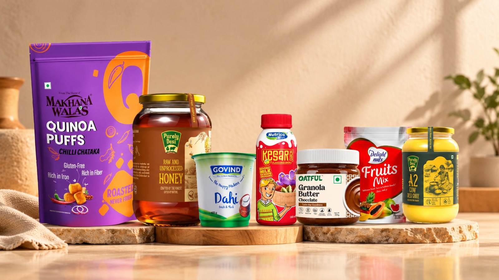
Walk down any supermarket aisle and count down how many products you notice. Now count how many you actually remember. The gap between these two numbers is where great packaging lives. A shopper decides in seconds, and mostly in half a second it takes a glance to travel across a shelf. In that window your pack has to say what the product is, who it’s for and why it deserves a spot in the basket.
That’s a lot to ask of a box, pouch or bottle, and it’s why unique packaging is no longer a nice to have. It’s how brands get picked. At White Warbler Communications, a packaging design agency in Pune, we work with food, beverage and FMCG brands every day. We’ve seen what makes a package stop a shopper mid-stride and what makes it disappear. Here are 15 creative packaging ideas to get your next design moving, starting with the foundations and moving into more experimental territory.
Foundations of Unique Packaging
1. Bold, Confident Colour Blocking
In a category full of reds, golds and greens, the pack that picks an unexpected colour owns the shelf. Think a deep teal in a sea of oranges, or a single saturated shade across the entire range. Colour is processed before text, so it’s your fastest signal.
2. Typography As The Hero
Sometimes the most striking design has no illustration at all. A well crafted wordmark, oversized lettering or a distinctive typeface can carry a pack entirely. It works especially well for brands with a strong name or a sharp tone of voice.
3. Minimalism with a Point of View
A clean, calm package can be loud in the right context. When competitors shout with badges, bursts and claims, restraint reads as confidence. The trick is intention: every element left on the pack should earn its place.
4. Illustration That Tells a Story
Custom illustration gives a pack personality that stock imagery never can. A hand drawn farm, a stylised map of an ingredient’s origin or a quirky mascot can make a product feel crafted rather than manufactured.
5. Transparent Windows
Let the product speak for itself. A die cut window, a clear tub or a glass jar shows freshness, colour and quality instantly. This is particularly effective for dry fruits, granola, sweets and snacks where the product itself is the best advertisement.
Structure and Material: Creative Packaging Solutions That Feel Different
6. Unexpected Shapes
A pack that breaks the rectangle gets noticed. Hexagonal tubs, tapered bottles and boxes with curved edges all interrupt the visual rhythm of the shelf. Custom structures do add tooling cost, so they work best for hero products and premium ranges.
7. Sustainable and Recyclable Materials
Kraft paper, moulded pulp, mono-material pouches and plant-based inks tell shoppers you care about more than margins. Sustainability is also a design opportunity, since natural textures and earthy palettes give a pack a tactile, honest look. One caution: be specific and truthful about what’s recyclable, because vague green claims erode trust.
8. Reusable Packaging
Give the pack a second life and your brand stays in the home long after the product is gone. Think tins that become storage boxes, jars that double as tumblers or gift packs designed as keepsakes. This is among the most effective creative packaging solutions for premium and gifting categories.
9. Tactile Finishes
Matte lamination, soft-touch coating, spot UV, embossing and foil stamping make people pick a pack up, and a shopper who picks it up is far closer to buying it. Combine a matte surface with a single glossy logo and you get contrast that looks expensive without a complete redesign.
10. Smart Opening Experiences
The unboxing moment doesn’t belong only to electronics. A tear-strip that reveals a hidden message, a drawer-style sleeve or a lid that opens like a book can turn a routine purchase into a small ritual. It’s also what people film and share.
Creative Food Packaging Ideas
Food and beverage packaging has extra jobs to do: protect freshness, signal taste and build appetite. These creative food packaging ideas do all three while still turning heads.
11. Packaging That Mirrors the Flavour
Use colour, texture and imagery to make the flavour almost tangible. A dark, glossy pack with a sprinkle of illustrated cocoa nibs says indulgence; a bright, citrus-toned pouch says zing. When shoppers can “taste” the pack, the buying decision gets shorter.
12. Nostalgia and Cultural Roots
Indian food brands have a goldmine here. Festive motifs, regional patterns, vintage typography and the warmth of home-kitchen references create instant emotional recall. A mukhwas or dry fruit pack that feels like it came from a family kitchen, or a festive gifting range around Raksha Bandhan or Diwali, connects far deeper than a generic “premium” look.
13. Portion and Format Innovation
Sometimes the most creative idea is a new format. Single-serve sachets, snack-on-the-go sticks, stackable cups and resealable pouches solve real problems for real people. When design and function work together, the pack becomes part of the product’s value.
14. Playful Copy and Personality
Packaging is prime real estate for brand voice. A cheeky line on the back, a witty ingredient list or a friendly note under the lid gives shoppers a reason to smile. Brands such as new-age beverage and snack labels have proven that a pack with a sense of humour gets talked about.
15. Clear, Honest Information Design
Finally, the least flashy idea may be the most powerful. Clean nutritional information, easy-to-scan benefit callouts and clear icons for vegetarian, high-protein or sugar-free build trust fast. In a health-conscious market, a pack that communicates well often outsells one that merely looks good.
How to Choose the Right Idea for Your Brand
Not every idea above belongs on your pack. The best unique packaging starts with strategy, not decoration. Before you choose a shape or a finish, ask:
- Who is the shopper? A college student grabbing a snack and a parent buying a festive gift box respond to entirely different cues.
- Where will it be sold? A pack that shines on a modern trade shelf may get lost on a kirana counter, and an e-commerce pack has to look good as a thumbnail.
- What do competitors look like? Stand in the aisle, photograph the category and find the colour, shape or tone no one is using.
- What’s the budget and the volume? Custom structures and premium finishes are investments, so match them to the product’s role in your range.
This is exactly how we approach every project at White Warbler. We start by understanding the brand, the audience and the market, then define where the opportunity sits before a single design goes on screen. Our packaging work spans concept, structure, typography, colour, illustration, die-lines, 3D visualisation and print-ready artwork, so the idea on screen survives all the way to the shelf. That approach has helped brands like Delight Nuts, SVVAD Pro, Urban Monk and The Coffee Craft show up differently in crowded categories.
Final Thoughts
Standing out on the shelf doesn’t require a huge budget or a radical gimmick. It requires a clear idea, executed with craft and aimed at the right shopper. Whether you lean into bold colour, a reusable format, a nostalgic story or a witty line on the back, the best creative packaging ideas share one trait: they make the product feel like it was made for the person picking it up.
If you’re launching a new product or refreshing an existing range, the packaging is often the single most valuable piece of marketing you’ll ever print. Make it count.
Ready to make your product impossible to ignore? Explore our packaging design services or get in touch with the White Warbler team to start the conversation.